Saturday, December 3, 2016

Little Bathroom with Big Style and Storage


Hubby and I are at our son's home this week since our house is uninhabitable! We are getting new HVAC and that means we have no heat. So this is our bathroom for the week.

It was originally a 1950's style pink bathroom - pink tub, pink toilet, pink sink, pink wall tile, and even pink floor tile. My understanding is that Mamie Eisenhower loved all things pink and is responsible for the plethora of pink bathrooms from that era. The house my parents bought in 1957 had a pink bathroom with gray accents. Sorry there are no "before" pictures, but with an estimated 5-10 million pink bathrooms from that era, I bet most people have a nightmare memory of a pink bathroom.

In spite of the fact that all female visitors under the age of about 8 loved the "princess" bathroom, Daniel thought the room did not match the rest of his house and told me he would bankroll anything I wanted to do with it. He liked my suggestions for subway tile, octagonal floor tile with the black squares, and bead board. And since I spend way too much time at his house, I wanted to create a unified look with loads of storage.


I found a vanity at Home Depot HERE and a medicine cabinet at Lowes HERE, both very reasonable priced.


The vanity has three functioning drawers and cabinet space under the sink. 


The medicine cabinet has the three little cubbies, and the baskets came with it. My wonderful contractor removed the piece of wood on the bottom so he could make the shelves and the cabinet look like one piece.


Then he attached the shelves he had made, extending the bottom shelf under the cubbies,  and finished it all off with crown molding. 


With the drawers in the vanity, the medicine cabinet with cubbies, and the open shelves, I got the storage I wanted and an attractive new bathroom for my visits. 

Do you have a pink bathroom story? I would love to hear it.


Tuesday, November 22, 2016

Les Deux Oiseaux Bistro


Les Deux Oiseaux Bistro on a surprisingly warm day in November. The perfect day to enjoy an 
al fresco meal of crusty bread, bleu cheese and fruit. 


I am learning that my trash-to-treasure posts are very popular. And this one definitely started out as trash. 

If you recall, the house came with 2 ugly boring lamps sitting on 2 even less attractive TV trays. You can look HERE to see what I did with the lamps. 


The TV trays were never very fine. The top is a plastic surface meant to look like parquet, I guess. The legs are starting to rust. 


The underside gives a really good idea of the condition and a look at the original masonite. 


I started by painting the top with Annie Sloan Chalk Paint in Old White. This took 2 coats.


I wanted this to have a weathered look, so I used the blow dryer to create a cracked finish. That discoloration is rust or mold or something bleeding through the paint. This probably sounds strange, but I like the discoloration.


I wanted to make these look like signs so I could hang them on the side of the house when they are not in use - decorative and functional!

To find printable French signs, I went HERE

Since I was going to be applying the image face down, I selected two that were mirror images with words and pictures. To make my selection, I printed out all the ones I liked and held them up to the window so I could read the words. Don't skip this step or you could have a surprise. This one of The Two Birds Bistro was my favorite! I also like the sign for Patisserie (Bakery) & Confiserie (Sweet shop). You can see the second one behind.

I printed out my two choices large enough to fill an 8.5 x 11 piece of paper. Then I took them to the office supply store and had them enlarged to 11 x 17. This is just regular laser jet printing.


I applied another coat of paint, just where the paper would be. I put the paper face down on the wet paint, covered it with a piece of plastic wrap for protection,  and then made sure all the air bubbles were out by using an old wallpaper roller I had. I let it dry COMPLETELY - about 4 hours. 


Now the fun part! I just spritzed it with water and rubbed the paper away with my fingers.

Sorry, I forgot to take a picture of the black painting. I used some of my old chalk board paint to cover the rusty fake gold on the legs and edge of the top. 


You can see how the paper comes off to reveal the printing that has stuck to the paint.


I used a pencil to sketch a faint line where I wanted to create an edge, then used an old artist's brush to paint on the French Linen. It is freehand, so the look is rustic.


I wanted to make the Old White a little more gray and make the cracking stand out, so I did a wash with half water and half Paris Gray, quickly wiping away as I did it in two stages. Because I plan on using these outside, I did not use dark wax. I don't know what it would do, but wax is not recommended for exterior use.


I had to work quickly, so there is not a picture. But you can see the shadows it created here.


Now it's time to relax and enjoy a light meal before I attack the Patisserie Confiserie sidewalk table. I thought they deserved a new name!


Saturday, November 19, 2016

The House in the Garden - Chapter Two


Now we begin the second chapter of our tale. In true Dickensian style, the hero's story will be told in eagerly anticipated installments. In the beginning, his bleak life is unattractive and seemingly hopeless, until a generous benefactor takes an interest.


 There will be laughter and tears, villains and charming girls. 


Unexpected, totally random problems that must be solved will present themselves, leaving us wondering if life will ever work out for our  poor, unfortunate hero. About half way through the tale, the readers will begin to wonder if this story will ever end. 


 But ultimately, the hero will have his happy ending in the company of loving family and loyal friends.


One of my goals in writing the blog is to document the entire transformation of the house. And since everyone wants to see the "before," a few ugly, boring entries are how things must start. Personally, I like to read about projects that show me the beautiful "after" pictures. 

This is the "before" main level floor plan. Each of the three rectangles was a separate construction.

 The original house is on the right. It included the living room, kitchen and upstairs with two bedrooms and a full bath. The upstairs is small and will only have cosmetic work done.

The middle section was the first addition - a laundry room, sun room, and work shop.

The left section was the second addition - a study and master suite.

More details can be found in Chapter One - HERE


Here is our new floor plan. We are making an opening under the stairs to connect the living room to the sun room ... through the old workshop! The old sun room, old study, and old workshop will be combined to make a new great room with kitchen, dining area and family room. This will be the heart of the house. The old kitchen will become a small office for me and a powder room. 


We got the permit a few weeks ago and demolition has begun. First, the wall was removed between the kitchen and the living room. Parts of it were cinder block and made quite a mess.


But I have the neatest contractor ever! He always cleans up before he leaves for the day. Yoshi is wondering what happened.


Next the studs and other wall were removed. And, of course, the jumbo vacuum is in the center of the picture.


The wall between the sun room and the workshop was then removed. 


The green tape is where the new doorway will be cut.

Next week will be short because of the holiday, but I suspect the new doorway will be cut and some additional cinder block removed. There will also be some preliminary work done for the new central air conditioning and heat. The house currently has two window A/C units. One is in an upstairs bedroom and the other is in the back, downstairs bedroom. Boring but necessary.


And when we are finished and the cherubs and Greek gods are painted on the ceiling, it will look just like this!

Just in case you are wondering, the illustrations are from a 19th century edition of Bleak House by Charles Dickens. Somehow that seemed appropriate. There was even a cat in a couple of the pictures!


Friday, November 18, 2016

November in the Garden


Next week the old porch will come off, and the exterior transformation will begin. This will probably be one of the last "before" pictures.

The leaves have turned and our giant oaks are mostly brown. I am jealous because the neighbors' oaks have more red and orange than ours!


 I am especially envious of the bright red maple across the street, 
even when I have to rake the leaves.


The nandina berries are coming into their fall color.


Close up you can see the oak leaves that have fallen in the bush.


We have an amazing view of the hills of south Arlington. In the distance, the trees are yellow, red, brown, and green. As I child growing up in West Texas, we cut leaves from construction paper, but I never really understood what we were doing. Now I know.


I have no idea what it is, but this fragrant purple flower has just now begun to bloom.


 The Chinese lanterns are still around and look beautiful with the turning leaves of a little volunteer oak..


A nice spot to sit and enjoy the pleasant weather we continue to have.


Last month the neighbor was obsessing over the acorns. Now I understand why. I thought I would just rake them up with the leaves, but they have already started to sprout and must be pulled out of the ground by hand. It's like trying to vacuum straight pins out of the carpet.


I raked the brick path yesterday, and it is already covered again.


This is the tall camellia at the back of the house. It is an evergreen and has my first blooms in the spring - a pale pink, 3 inch, waxy blossom. One of my favorites! It is fun to see the promising green buds tucked between the leaves.


The leadwort by the front door still has a few blossoms, and the leaves are a beautiful red.


Maybe it's because the fall has been so mild, but the rose is very happy.


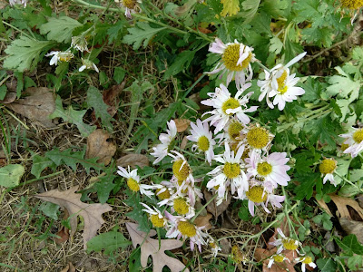
The chrysanthemum put on a little bit of a show, but I forgot to take a picture at its peak. Still not a favorite. I will probably get a replacement next fall.


The fall blooming camellia is still going with its small pink flowers. Trying to think how I can make this stand out more. Ideas, anyone??


Here's the part I am choosing to ignore - construction rubbish. In front and on the side of the house are piles that grow with demolition and shrink with runs to the dump.


I see leaf raking in my future.